
Radical Patronage: Phoenix Art Museum
2018 Phoenix Art Museum Artist Grant recipients Malakai, Elliot Jamal Robbins, Papay Solomon, and Taylor James, along with the Arlene and Morton Scult Artist Award winner, Julio César Morales, insist on addressing the politics of Arizona’s intersectional and diasporic communities.
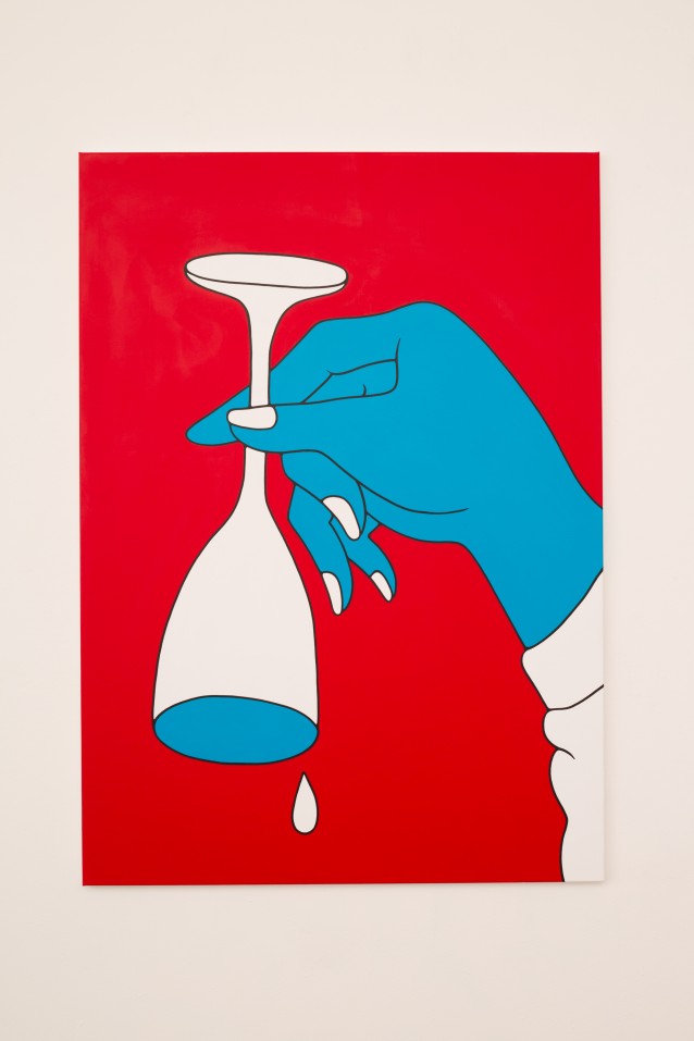
Parra – Same Old Song
The works in Same Old Song are overturned wine glasses, leisure-suited perverts, and behind-the-bar-booty slaps arranged in compositions of red, white, blue, pink, Ben-Day dots, and stars. In all its orgiastic fervor, his work is foremost graphic in character: tightly controlled compositions, highly saturated colors, flood-filled silhouettes, flatness, and hard edges that are hallmarks of the comic tradition that Lichtenstein had notoriously usurped to conflate the proverbial high-and-low strata of the 1960s Pop movement.
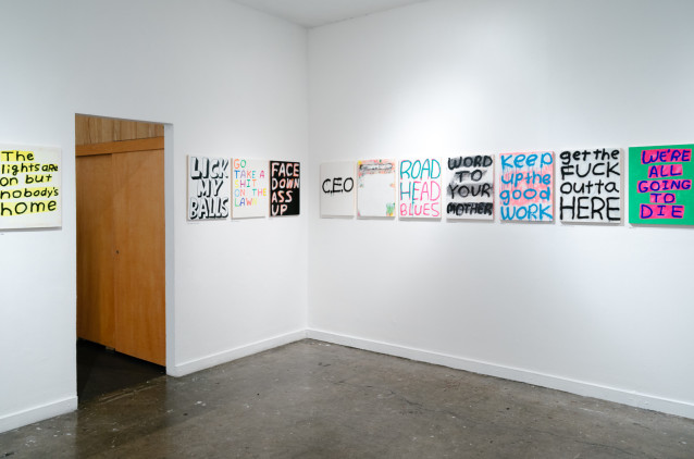
Madsaki – Please Don’t Spit on the Painting
“Please Don’t Spit on the Painting” is scrawled on a xeroxed-textured background signed “MOMA” in its unmistakable Gothic font. As if a starch-suited museum executive muttered these words to a delinquent gallery goer. Is it a plea for recognition or a show of total institutional irreverence? Who is really spitting at whom here?
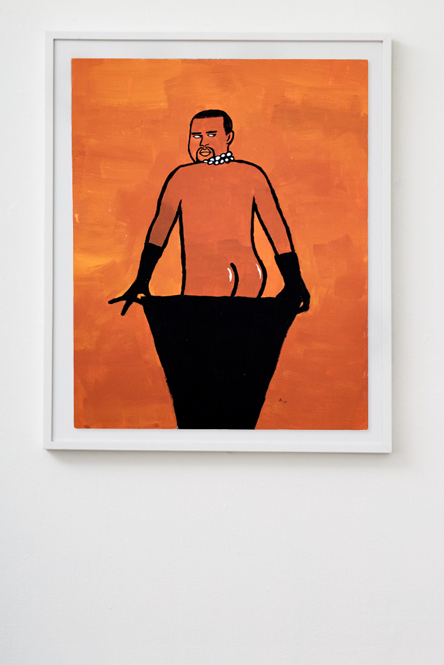
Jean Jullien – Poor Traits
A crowd of self-satisfied urbanites holds fruits to their ears with unbroken focus, tapping away obliviously, some taking selfies with their literal “apples.” A dress that is blue & black and white & gold.

Brian Roettinger – 8 Announcements
Gallery announcements are a problem. They are often produced cheaply, in large quantities, and made to disseminate with aggression: fliers posted on fences, cards littered on street corners, fistfuls pushed into legions of numbed post-show crowds. There is a garishness and unapologetic solicitation that accompanies fliers which are made by organizations that have the money to print them but not the reputation to forgo them.

Hassan Rahim – Distillations
Distillations is a refusal. Collage overlays images to connect disparate contexts and temporal zones. People and objects are layered, decontextualized, cut, and pasted into oblivion. At some point, a lack of restraint only leaves heaps of forced narratives, absurdity, and theoretical hash.

Erin D Garcia – 5 Shapes in 6 Colors
Erin’s geometric abstractions derive from a mother structure of Stacked blocks and volumes rendered in a series of colors. He deconstructs this architecture of color into a simpler lexicon of lines, arches, and curves in an ongoing search of other primary structures, or as he says, “elements”.
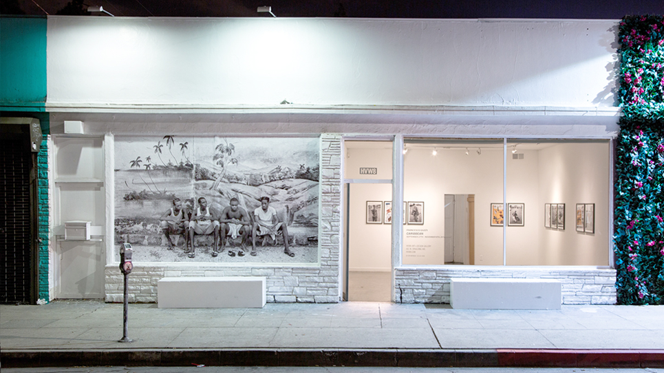
Francesco Giusti – Caribbean
Proin id arcu aliquet, elementum nisi A ribbon in green, yellow and red is strung with Junior written in 70′s bubble font, as memorial. The epitaph commemorates the death of a man who contributes a meaningful part of the neighborhood, a supermarket and a garden.
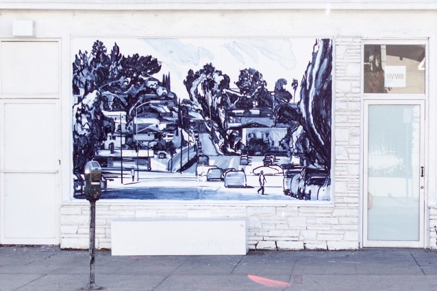
Brian Lotti – Echo Park
A self-proclaimed (and formally accurate) Impressionist, Lotti works with an easel outdoors, plein-air, and uses varied swathes of vibrant color, quick staccatos, and heavy impasto strokes to form alleys, figures, horizons, color blocked houses on hills, and feathery palm trees to capture the spontaneity of atmosphere, light, and movement in the immediate environment.

Sergej Vutuc & Rich Jacobs: I Don’t Have to Know You to Wave to You; Agathe Zaerpour & Philippine Chaumont: Uzuri-Ubichi
Disjunct frames of empty lots, shadowed alleyways, black and white striations etched with ectoplasmic writing fill the pages of a two week collaboration in Oakland between skate dada Sergej Vutuc and “beautiful losers” progenitor Rich Jacobs who have jointly published the zine “I don’t have to know you to wave to you.” // “We met Kylie, sixteen years old, student in Mombasa, on Nyali Beach, and asked her about what she liked to wear on the beach. She is keen on smart dresses, even on the sand, and doesn’t understand why everyone, especially the tourists, seem to think they can wear very casual and short clothes just because they are not in the street…”